UPA - Gerald McBoing Boing
The primary aspect of my thesis research at ACCAD is based on the visual style used by the artists of the UPA studios. As many of you know, this UPA style was quite popular during its time and still is, considering how it continually influences animation artists today. (All you have to do is watch Cartoon Network or Nickelodeon for twenty minutes and you’re guaranteed to witness several examples of UPA influence. )
GERALD MCBOING BOING:
The film Gerald McBoing Boing (1951, directed by Robert Cannon, designed by Bill Hurtz with color styling by Jules Engel based on a story by Dr. Seuss) is, visually speaking, the UPA film of most relevance to the design of my film, Stay Cool. I mean not to convey that I am in any way attempting to copy or even emulate the style of Gerald, but rather to construct my own set of design principles based on the knowledge gained from an in-depth study of it.
For you uber-geeks out there, I have posted a visual analysis of the construction of one of the shots from Gerald McBoing Boing. Since the writing of this, I have learned quite a bit that has broadened my knowledge and awareness of the visual fabrication of this film even further. I will, if the interest exists, continue to post on this site, resopnses to the knowledge I have gained through my research and through the analysis of the design of this and other UPA films.
VISUAL ANALYSIS:
Gerald opens with a relatively complex shot of Gerald’s family together in what appears to be a classy suburban living room.
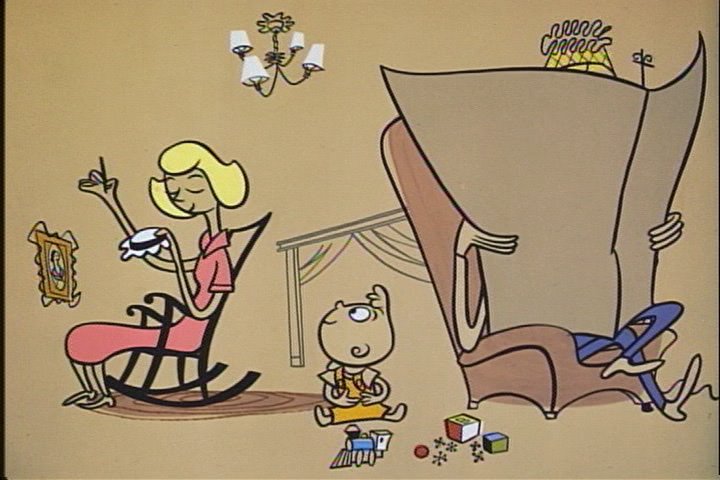
REPRESENTATION OF SPACE AND FORMS :
The space in the room is not clearly nor firmly established.
By ‘firmly established,’ I am referring to similar representations of the same space in the rest of the film. There are shots of what seem to be this same room that do not retain the same dimensions or even the same details. Some of these discrepancies are perhaps intentional and others come across as superfluous.
By ‘clearly established,’ I am referring to the amount of (or the lack of) detail needed to clearly convey the size, perspective and proportions of this particular space (the living room.) Most prominent is the elimination of ground, wall and ceiling lines. These planes are only implied by the placement of a picture hanging on a wall, a rug placed on the ground and a small chandelier hanging from the ceiling.
The room is, instead, only one flat field of color, a warm beige. The space is also implied by what is later revealed to be a doorway with drapery in the distant background, though it is not clearly discernable as a doorway with drapery in this shot. The drapes and frame are visible, but it is unclear in this shot exactly what the shape is. It is represented with gentle and light lines.
The forms in this shot are all handled very similarly. They are all soft and clean, the line work varied in thickness and minimal, curves and arcs removing all angularity or harshness. This contributes to the overall feeling of suburban serenity that Gerald’s noise-making quirk is about to disrupt.
Some of the forms, like the Father’s armchair are established with not only line, but also a shape of flat color, usually even more simplified in form than the surrounding linework. The simple shapes of flat color do not completely fill the lines that depict the forms. This creates a rigidity and a sense of volume where the mere line work could appear less substantial.
Greater care has been taken to fill the characters with various flat colors precisely within the lines that break up the characters’ silhouettes. The number of colors used is still drastically limited. This relative precision in filling these areas of color tightly within the lines helps to separate the characters from the environment without diluting the concept held by the UPA artists as “…they inclined more to the idea that the boundary between characters and backgrounds should be erased.” (Michael Barrier, Hollywood Cartoons, 506)
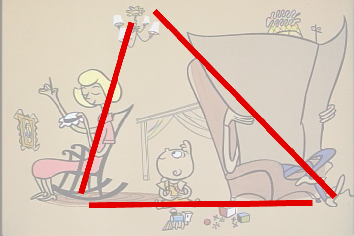
COMPOSITION :
The composition of the shot is balanced but not without tension. The Father, with his large newspaper, thick armchair and the neighboring reading lamp all group together to create a heavy visual mass that pulls the composition to the right of the frame. Balancing the Father’s side is much more negative space on the Mother’s side, which becomes a form of its own with an equal amount of visual weight.
Tension is added with the placement of the chandelier to compliment the diagonal line created by the Mother in her chair. The opposing strong diagonal runs through the top, left corner of the newspaper to the Father’s feet and the static, straight line implied by the rug, Gerald and his toys and the bottom of the armchair creates a very classical triangular composition. The main character, Gerald, from an animation standpoint, leads the action in this scene. He initiates the on-screen action and is thus the dominant form and the visual center of the composition.
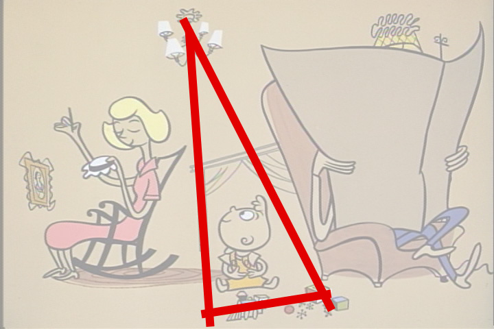
The chandelier, Gerald and his toys also create a similar, smaller compositional triangle to further reinforce his visual and narrative dominance.
The character that reacts most strongly (and most humorously) to Gerald’s shocking noises is the Father. He is the secondary focus of the narrative of this scene, his reaction following Gerald’s lead.
The design of the Father, though covering a large percentage of the picture, is correspondingly sub-dominant. His placement within the frame, off to the right, compliments Gerald’s central position. Had the Father and his accompanying mass of forms been moved toward the center of the frame, the visual harmony would have been completely disrupted, the narrative focus removed and the clarity of the communication of the story compromised.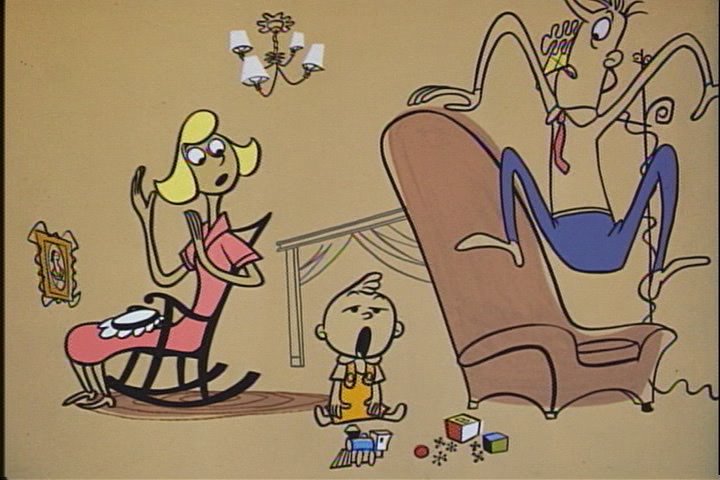
If Gerald is the dominant form, despite his small size, and the Father is the sub-dominant form due to his compositional placement, then the visual grouping of the Mother and her rocking chair is clearly the subordinate form. Her role in this scene is tertiary, her presence merely a necessity in order to establish her character in the story.
I believe that the final clue that proves that this all was the designer’s intent is the aforementioned ambiguous doorway in the background of the room, the center of the composition. The lintel of the doorway is slanted downward toward the mother and upward toward the Father, framing Gerald in its middle. This lends more weight on one side of the doorway to the Father and his surrounding shapes and less to the Mother and hers. This obviously punctuates Gerald’s center position as well.
Not to forget the accents, the painting on the wall lends strength to the Mother’s diagonal direction. The curves in the top, right corner of the newspaper, as well as the curve of the Father’s toes lead the viewer’s eye back into the frame instead of just directing it out of the frame. Every aspect of this composition serves a purpose. It is either there to communicate the narrative clearly and/ or to serve the overall composition. The end result is minimal but elegant and full of meaning.
posted by oats at
7:11 PM
![]()
![]()

0 Comments:
Post a Comment
<< Home